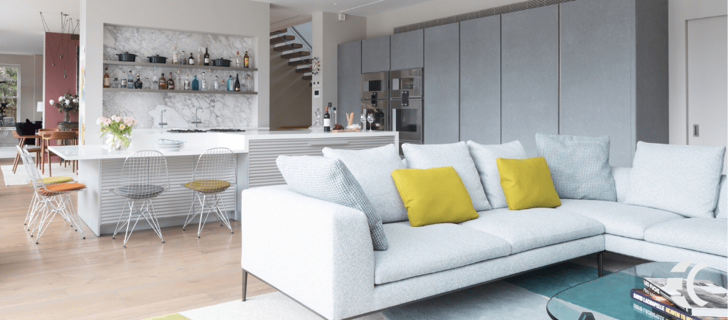
Most of us are more than ready to get the HECK out of 2020. Life needs a refresh. Our homes and offices likely need one too since, well…we haven’t been getting out much.
How do we turn up the happiness dial in our beloved spaces? Inspiration is as close as 2021 color trends.
The theme of these new color trends are “relax,” “recharge” and “comfort,” which sound like the perfect antidote. Below you’ll find color hues that create a calm base. You can then stay serenely monochromatic or add pop with accent colors that reflect your personality.
BEHR® 2021 Palette
Architectural Digest says that Behr’s vice president of color and creative services mentions “escapism, the outdoors and timelessness” as guiding influences in the company’s 2021 color choices.
The collection offers light, comfort colors along with restorative blues and greens, optimistic brights and rich evocative tones. With 21 new colors in all (coincidence?!), your mathematical odds of finding a winner soar.
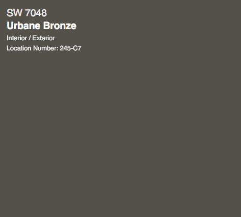
Sherwin Williams: Urbane Bronze
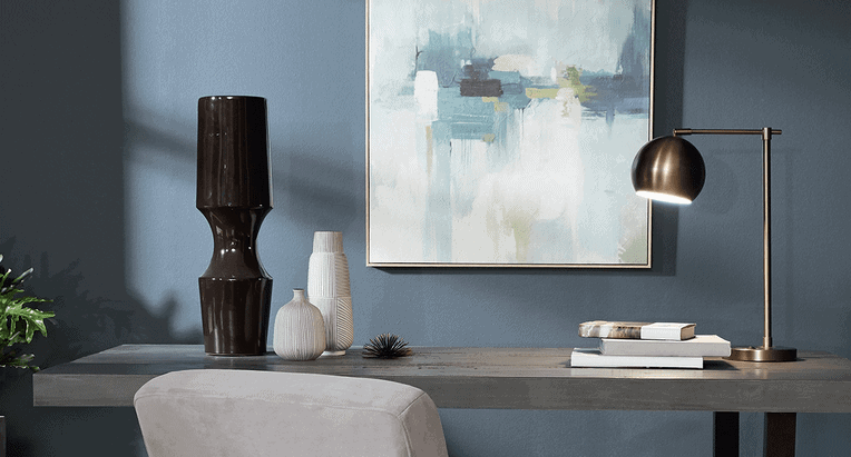
Described as “grounded, meditative and serene,” this rich tone is decidedly influenced by mother nature. It’s a perfect choice for a room with natural light and a beautiful, earthy backdrop for that Fiddle Leaf Fig plant you’ve managed to keep alive longer than you dared imagine.
Stone finishes and wood also pair nicely with its warmth. This bronze also plays well with the gray tones many of us have painted on our walls over the last few years. So, you won’t have to completely upend those recent paint upgrades if you make dip a paintbrush into its urbaneness.
Become an EC Collector to easily purchase art to love.
Become an official EC Art Collector
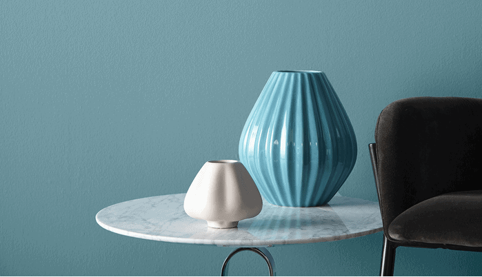
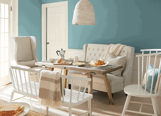
Benjamin Moore Color of the Year: Aegean Teal
Channeling some calm straight from the Mediterranean Sea is top of mind for Benjamin Moore with a beautiful blue-green. It’s a great mid-tone. Andrea Magno, the director of color marketing and development, says that this and surrounding colors in the palette express “ a welcoming and lived-in quality.”
They’re optimistic hues that celebrate the simple pleasures—think the faded rumple of linen sheets in the morning and perfectly ripened fruits on the windowsill. With twelve variations that radiate warmth and wellbeing, your home will feel even more like home. Settle in.
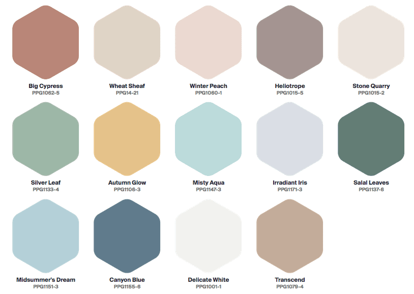
Pittsburgh Paint Company 2021 Palette
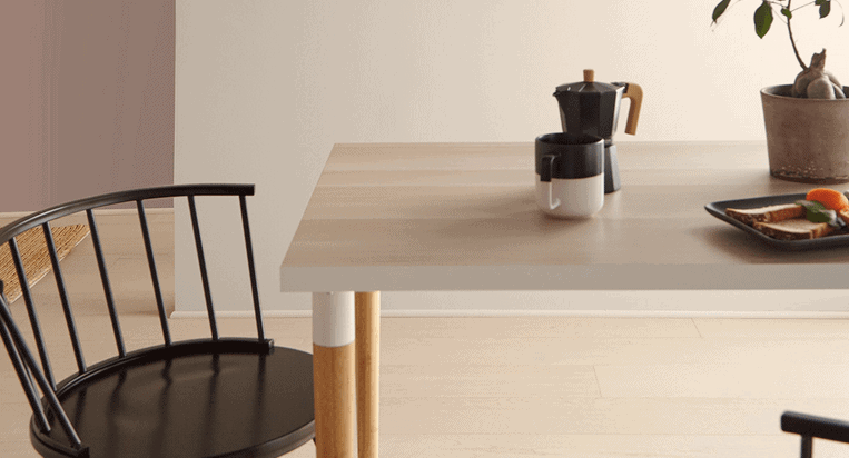
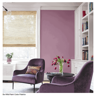
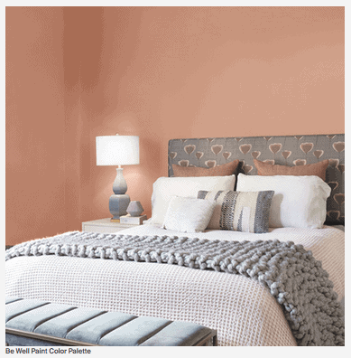
Featuring nostalgic neutrals and comforting hues, PPG’s first-ever Color Palette of the Year is named “Be Well.” Feelings of mindfulness and intention are at its core. If this past year has taught us nothing else, it’s reminded us of the joy of simple, everyday moments like riding a bike, homecooked meals and a nature walk. We’ve had to tend to our health and watch out for the health of others. It’s been a master class in nurturing our inner lives to cope with disruption.
The color trio celebrates beauty of all kinds and connects with those who prioritize wellness in mind, body and spirit.

Color connects to our inner world
Books have been written on the psychology of color. So, I won’t digress too much here. But we’ve all managed to power through a year unlike any other. The color we surround ourselves with, from walls to accents and art, can nudge our serenity (or whatever feeling we want to evoke) in a positive direction. After spending more time inside than we’ve likely done in a while, bringing in more visual support is a no-brainer. Perhaps this is the nudge you needed.
Which color trends will bring you back to center in 2021? Do you feel they’re what the majority of us crave right now?
This article was written by Andrea Bogart, the founder and lead art advisor of Embrace Creatives.
SHARE TO INFORM
